The logo for the College of Education and Human Ecology is a variation of the university’s logo and the primary identifier used in all college communications.
Consistent and correct use is essential to reinforce the brand recognition and reputation of the college to our audiences.
Like the university, the college identity system prohibits the use of any additional iconography, marks or artwork in conjunction with the college logo.
COLLEGE LOGO ELEMENTS
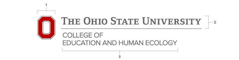
- Block O
The iconic identifier of The Ohio State University. The Block O should be displayed with the wordmark and secondary signature at all times.
- Wordmark
An adjusted letterform version of the name “The Ohio State University” combined with a baseline. It cannot be replicated through typesetting.
- Secondary signature
The college identifier including the name “College of Education and Human Ecology.”
CONFIGURATIONS AND CLEAR SPACING
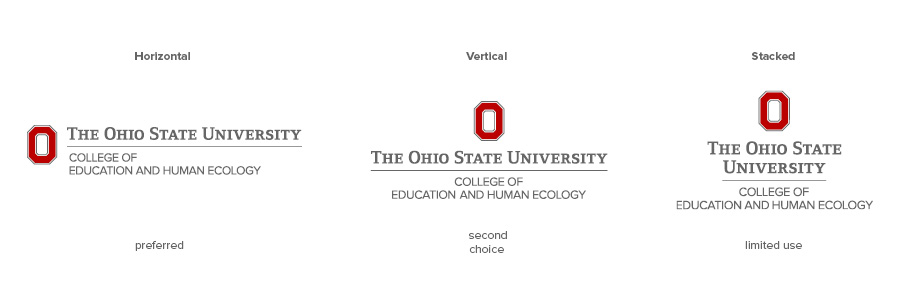
There are three approved configurations of the college logo, of which the horizontal is the preferred and primary version. The vertical and stacked logos are distinct options, and none of the three should be recreated.
- Horizontal logo (preferred)
- Vertical logo (second choice)
The vertical configuration may be used in circumstances when the horizontal logo is impractical to use.
- Stacked logo (limited use)
The stacked logo is for use in restricted spaces where neither the horizontal nor the vertical version is feasible, such as one-column ads, podium signs or certain merchandise or apparel.
“Clear space” is the protected area around the college logo that maximizes its impact. The space must be free of all other graphics and text, including other logos. The minimum required space around the logo is defined by the width of the Block O.
Other important notes
- The logos must not be altered in any way, and additional configurations are not permitted. Do not recreate the logo.
- When the logo appears on merchandise or apparel, it should always have the registration mark, (®). The registration mark is not needed on stationery, marketing collateral or digital communications.
MINIMUM SIZE
The Block O should not appear smaller than 0.375 inches tall in print. For digital, the minimum size is 32 pixels tall, but the preferred size is 50 pixels. The proportions of the Block O in relation to the rest of the logo should not be changed.
COLOR VARIATIONS

The preferred use is scarlet and gray on a white or light background. This version should be used whenever possible. If the preferred use is not possible, the following variations (and only these variations) may be used:
- Scarlet and gray (preferred)
- Scarlet and black
Use when the background requires a darker representation of the wordmark.
- Black
Use when ink colors are restricted or the use of scarlet creates a design conflict. (However, always incorporate scarlet in your design.)
- Scarlet
Use when ink colors are restricted or to achieve a particular design effect.
- Gray
Use when ink colors are restricted or to achieve a particular design effect.
- One-color reverse (preferred reverse version)
- Two-color reverse
When scarlet is needed in a reverse logo, use the two-color version.
LOGO PLACEMENT
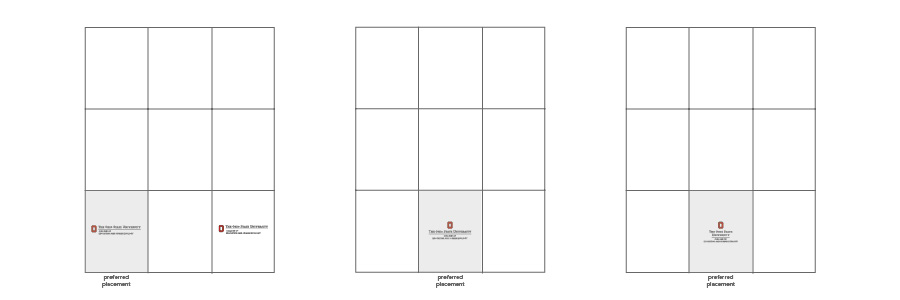
Logo placement is important to achieve maximum impact. Optimal placements for each logo configuration are illustrated above.
For centers, departments, programs, offices or other units in the college, Ohio State has developed a visual identity system to provide design prominence. A unit name may not be typeset to appear integrated with the college logo.
For assistance with college logos, please contact a member of the EHE Communications team.
LOGO RESOURCES
- Horizontal, vertical and stacked configurations
- All available color variations
- Logos with registered mark, ®